Does the Property Clock Really Work? We Back-Tested It

Property cycles are real. But do property markets actually rise and fall in the orderly, predictable sequence suggested by a “property clock”? We went back to historical Property Clock readings and compared them with what prices actually did next.

Property clocks are everywhere in Australian property commentary.
Recovery. Upswing. Peak. Downturn. Stagnation. Then back around again.
They are simple, visual and extremely easy to understand. They are also excellent for presentations. But there is a much more important question for a property buyer or investor:
Does the Property Clock accurately predict property prices?Property markets do move through cycles, but our review of historical Australian Property Clock readings found that clock positions did not consistently predict the timing or direction of subsequent price movements. The clock appears more useful for describing current market momentum than forecasting the next stage. |
Do Property Clocks actually predict what happens next?
That is a very different question.
At Concierge Buyers Advocates, we have always been wary of investment theories that make complicated property markets look deceptively simple. So rather than arguing about the Property Clock in theory, we decided to do something different. We went back to the Property Clock model and tested it.
We took several publicly available historical readings of Michael Matusik’s Property Clock, froze them at the date they were published, and then compared those market classifications with what residential property prices actually did afterwards.
The result?
Property markets unquestionably move through cycles.
But the evidence is far less convincing that those cycles behave like a clock.
First: what is the Property Clock?
The idea is easy to understand. A housing market progresses through different stages:
Recovery → Upswing → Peak → Downturn → Stagnation → Recovery
Michael Matusik has used his version of the Property Clock for decades and describes it as a simple way of showing the comparative “heat” of different housing markets. Importantly, Matusik himself has also acknowledged that property cycles are not evenly spaced.
In his 2021 explanation, he said housing-cycle phases were not equal in duration and that markets could occasionally miss an entire cycle. At the time, he referred to history suggesting roughly seven to eight years between peaks.
By May 2024, he described the typical property cycle as approximately four years, adding that he himself had previously used seven years. He also noted that the upswing can be short, a downturn can last longer, stagnation can occupy roughly half the cycle, and some markets may remain stagnant for extended periods. These are sensible qualifications and integral to understanding the purpose of the property clock.
But they also expose the fundamental problem with treating a Property Clock as a forecasting tool. If the “hours” can have completely different durations, the clock can stop for years, markets can miss phases and unexpected events can send markets in another direction...
Can we use Property Clocks to predict the property market?
That is what we wanted to test.
How we tested the Property Clock
This is not an academic econometric study, and we are not pretending it is. Our approach was deliberately simple.
We located published Property Clock readings that were available at the time, rather than reconstructed later with hindsight. We then compared those classifications with subsequent capital-city property-price movements using established datasets including:
Australian Bureau of Statistics residential property price data
PropTrack Home Price Index data
Cotality Home Value Index data.
Different datasets measure housing markets slightly differently, so we have not attempted to manufacture a single “accuracy percentage”.
Instead, we asked the practical question a buyer or investor would ask:
Did the Property Clock position give a useful indication of what happened next?
And that produced some interesting results.
Test 1: The Property Clock in late 2020
A published Matusik Property Clock in November 2020 placed the major capital cities as follows:
Capital city | Property Clock position |
Sydney | Downturn |
Melbourne | Downturn |
Brisbane | Start of upswing |
Adelaide | Peak |
Perth | Start of upswing |
Hobart | Peak |
Darwin | Start of upswing |
Canberra | Peak |
The contemporary report specifically stated that Adelaide, Canberra and Hobart were at the peak, Sydney and Melbourne were in downturn, while Brisbane, Darwin and Perth were at the beginning of an upswing.
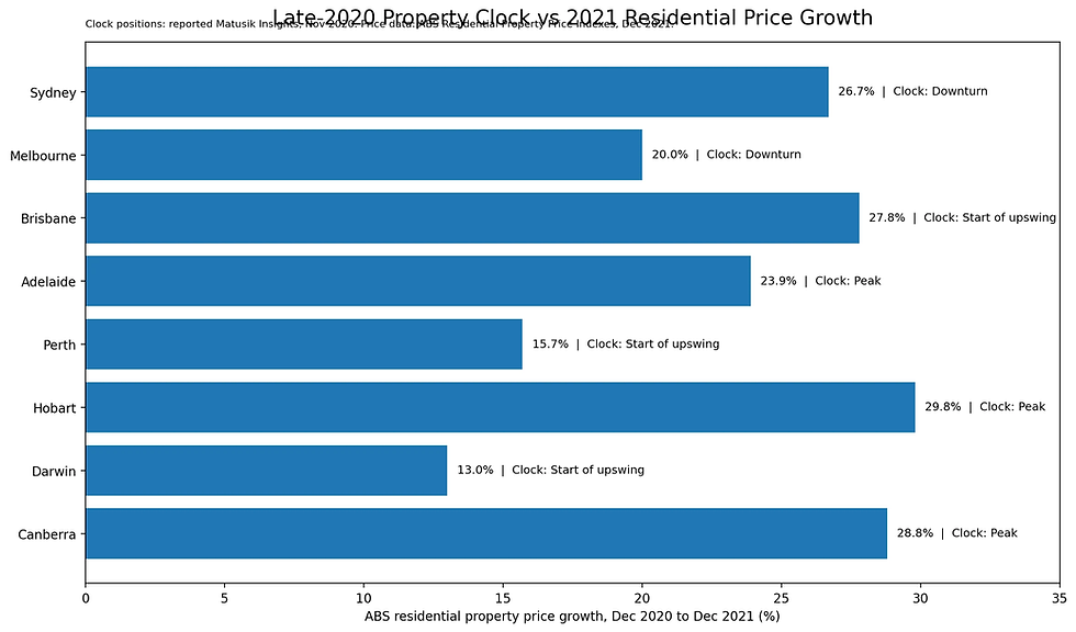
So what happened next?
According to the Australian Bureau of Statistics, residential property prices increased during the following year by:
Capital city | Clock position | Price growth: Dec 2020–Dec 2021 | Result |
Sydney | Downturn | +26.7% | Different |
Melbourne | Downturn | +20.0% | Different |
Brisbane | Start of upswing | +27.8% | Correct |
Adelaide | Peak | +23.9% | Different |
Perth | Start of upswing | +15.7% | Correct |
Hobart | Peak | +29.8% | Different |
Darwin | Start of upswing | +13.0% | Correct |
Canberra | Peak | +28.8% | Different |
The weighted average across Australia's eight capital cities rose 23.7% over the year.
Some calls worked very well. Brisbane, Perth and Darwin were identified as entering an upswing, and prices subsequently rose strongly.
But consider the other side. Sydney and Melbourne were classified as being in a downturn.
Sydney then rose 26.7%.
Melbourne rose 20%.
More strikingly, Adelaide, Hobart and Canberra were classified as being at the peak.
Over the next year they rose another:
23.9%, 29.8% and 28.8% respectively.
If an investor interpreted “peak” as meaning the market was about to roll over, that would have been an expensive interpretation.
Was COVID simply an exceptional event?
Absolutely. The pandemic produced emergency interest rates, fiscal stimulus, behavioural changes, HomeBuilder incentives, unusually strong household savings and major changes in housing preferences.
It would be unfair to pretend anybody should have perfectly forecast what happened. But that actually reinforces the broader point.
Property markets don't operate inside a closed mechanical cycle.
They react to outside forces.
Interest rates change.
Credit availability changes.
Government policies change.
Migration changes.
Employment conditions change.
Supply changes.
Tax settings change.
Investor sentiment changes.
And occasionally, something as extreme as a pandemic arrives.
The market doesn't check where the hand is sitting on a clock before responding.
Test 2: April 2023
This is probably the most interesting historical test.
In April 2023, Matusik's published detached-housing Property Clock classified:
Capital city | Clock position |
Sydney | Downturn |
Melbourne | Downturn |
Brisbane | Downturn |
Adelaide | Downturn |
Perth | Upswing |
Canberra | Downturn |
Hobart | Downturn |
Darwin | Peak |
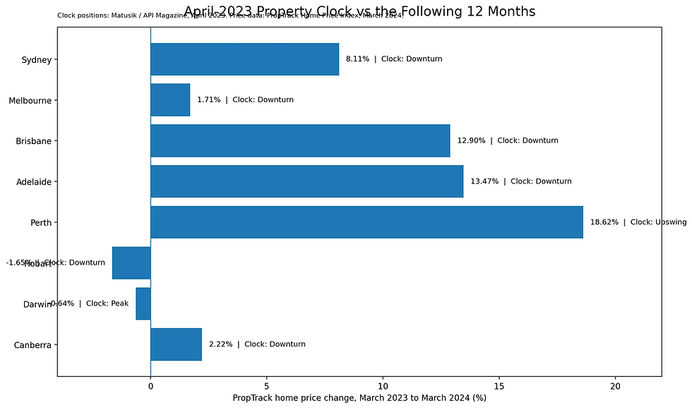
Only Perth was classified as being in an upswing among the capital cities.
Now fast-forward approximately 12 months.
By March 2024, PropTrack reported:
Perth: +18.62%
Adelaide: +13.47%
Brisbane: +12.90%
Sydney: prices had reached a new record high
Melbourne: +1.71%
Hobart: -1.65%
Perth was an excellent call.
But Brisbane and Adelaide were both labelled Downturn. Over the following year they rose approximately 13%.
Melbourne was also in the Downturn classification and subsequently recorded positive annual growth.
Sydney, also labelled Downturn, had recovered strongly enough to reach a fresh record by March 2024.
PropTrack described Perth, Adelaide and Brisbane as the strongest capital-city performers over the year, driven by relative affordability, population growth, tight rental markets, limited stock and strong buyer demand.
There is another important point here.
By May 2023, only weeks after that Property Clock was published, market commentary was already reporting that prices were stabilising or increasing again in Sydney, Melbourne, Brisbane and Adelaide.
Sydney rose 1.3% in April alone according to reporting at the time.
That suggests an inherent lag. And it is something that affects all property prediction data models. The clock may have accurately described the conditions that had just occurred. But property investors don't make money from correctly identifying yesterday. They need to understand tomorrow.
Data analytics systems are usually between 3-6 months behind in reporting what's actually happening on the ground. That's just the nature of the whole data collections, sanitising, remediation processes.
The distinction that matters
There is a major difference between a:
Descriptive indicator
and a:
Predictive indicator.
A descriptive indicator tells us what is happening now, or what has recently happened. For example:
listings are falling
auction clearance rates are improving
sales volumes are increasing
properties are selling faster
vendor discounts are narrowing
prices are rising.
Put those variables together and you might call the market an Upswing. That's perfectly reasonable. The information was already contained in the underlying data.
Putting those variables onto a picture of a clock does not necessarily create additional predictive information.
The danger appears when people make the next leap:
We are currently at 8 o'clock, therefore 9 o'clock comes next.
That conclusion does not automatically follow.
The 2026 market gives us another live example
On 19 February 2026, Matusik published an update titled The upswing isn't over. He wrote that most Australian markets, including all eight capital cities, remained in the recovery or upswing phase. His assessment was that higher interest rates would dull the cycle rather than reverse it and that 2026 was likely to produce slower and more uneven gains rather than a uniform housing downturn.
Now move forward only seven months. Australia's housing market peaked in March.

By September 2026, Cotality's national Home Value Index had fallen for six consecutive months.
National dwelling values were 5.2% below their March peak. Every capital city except Darwin fell during September. And 97% of capital-city suburbs recorded price declines over the preceding three months.
This isn't a completed 12-month test yet, so it would be wrong to declare the February forecast finally right or wrong. But it demonstrates just how quickly the market can change direction. It is not a fault in the model. It is a fault in how the readers interpret the information.
A housing market can move from:
“recovery or upswing”
to
a broad national downturn
within months.
That isn't how clocks behave.
Markets within Markets
To add another layer of complexity, there are many sub-markets within a single city. Different property types, suburbs, streets and price points can all behave differently, and often move through their own cycles.
The Glen Waverley market behave very differently from the Pakenham market. Houses in Clayton perform differently from apartments in Clayton. Even within the same suburb, different price brackets can move differently.
A premium $3 million family home may respond to very different buyer demand, borrowing constraints and market conditions than an $800,000 first-home buyer property.
That is another reason why applying a single “Property Clock” to an entire city can be misleading.
To Matusik's credit, his framework has evolved
In September 2026, Matusik described a more sophisticated approach. The new research examines approximately 30 Australian housing markets using population growth, transaction volumes, house and unit prices, recent price movements, vacancy rates, affordability, listings, buyer activity, construction
supply, employment, borrowing conditions and other local factors.
He also now distinguishes between a longer housing cycle and a shorter-term Property Clock designed specifically to identify current market momentum.
He explicitly says the aim is not “false precision”.
We think that's a much better description. And it leads to essentially the same conclusion we reached from the historical testing:
The Property Clock makes more sense as a market dashboard than as a forecasting clock.
Property cycles are real. Predictable property clocks are something else.
None of this means property cycles don't exist. They clearly do.
Housing markets go through periods of:
rapid growth,
slower growth,
falling prices,
low turnover,
recovery,
and renewed expansion.
But that doesn't mean those phases must occur in a predictable sequence or within a predictable timeframe.
Property markets are adaptive systems.
They are influenced by millions of buyers, sellers, investors, renters, lenders, developers, governments and businesses. Different cities respond differently. Different suburbs respond differently.
And even within one suburb, different property types can behave differently.
A family house inside a highly sought-after school zone can perform very differently from a high-density apartment 500 metres away, in the same suburb.
Calling both properties “10 o'clock on the Melbourne Property Clock” tells us very little about whether either property is a good investment.
A Property Clock can be a useful dashboard. The mistake is assuming the next hour must come next.
What is A Better Way to Analyse a Property Market?
Instead of asking:
“What time is it on the Property Clock?”
we would rather ask:
What is happening to listings?
Is stock rising faster than buyer demand?
What is happening to transaction volumes?
Are buyers actually transacting or merely browsing?
What is happening to credit?
Borrowing capacity can move markets surprisingly quickly.
What is happening to affordability?
A market can't indefinitely outrun the incomes of the people expected to buy into it.
What is happening to population and household formation?
Population growth matters, but only when matched with purchasing capacity and housing demand.
What is being built?
Existing dwelling supply, new construction, apartments, land releases and development feasibility all matter.
What are rents and vacancy rates doing?
These affect investor demand and relative housing affordability.
What is happening to employment?
Strong, diversified employment creates sustainable housing demand.
What are governments changing?
Taxes, incentives, planning rules, investor regulation and migration policies can materially alter behaviour.
And most importantly: what exactly is being sold in the reporting period?
This is the part generic market models often miss.
You don't buy “Melbourne”.
You don't buy “Brisbane”.
You don't even really buy “Glen Waverley”.
You buy a particular property, on a particular street, on a particular block of land, at a particular price.
Its future performance depends on far more than where somebody has positioned a city on a clock.
So, does the Property Clock work?
Our answer is:
Yes. It is a simple way of explaining current market conditions.
No. We would not rely on it as a property-market predicting timing system.
Our historical checks found several examples where the clock described markets as being at a peak or in downturn immediately before substantial price growth.
There were also good calls. Perth's 2023 upswing classification was particularly strong.
And Matusik correctly anticipated a significant slowing of the Australian housing market heading into 2022.

That is exactly why the sensible conclusion isn't:
“The Property Clock is wrong.”
It is:
“Don't mistake an easy-to-understand visual framework for a predictive model.”
The underlying research may be useful. The underlying analysis may be very good.
But the clock suggests a sense of orderly progression that property markets simply don't possess.
Our conclusion
Property investment is full of seductive shortcuts.
Hotspot lists.
Boom suburbs.
Top 10 growth locations.
Property clocks.
Crowd Sourcing in social media.
They work because humans like patterns and shortcuts.
The Proeprty Clock is particularly compelling because everybody instinctively knows what happens after 8 o'clock. Nine o'clock. Then ten.
But property markets does not behave that way
A clock whose hours can have different intervals, which can stop for years, skip numbers, miss cycles and occasionally reverse direction isn't really a forecasting clock.
If the clock hanging on your wall has variable intervals between the 3,6,9,12 o'clock, stops for a few minutes, skip a few beats and occasionally reverses, will you trust your clock?
The Property Clock is a property market dashboard drawn in a circle.
And dashboards can be useful. Just don't confuse them with a crystal ball.
FAQ - Property Clock
What is a property clock?
A property clock is a visual representation of a housing market moving through phases such as recovery, upswing, peak, downturn and stagnation.
Does the Property Clock predict house prices?
Not reliably enough to use by itself. Historical examples show some accurate directional calls and several occasions where markets classified as peak or downturn subsequently recorded strong price growth.
Are property cycles real?
Yes. Property markets experience periods of rising, falling and stagnant prices. The issue is whether these phases occur in a predictable sequence or timeframe. Historical evidence suggests they do not.
What determines property-price growth?
Important influences include housing supply, listings, buyer demand, credit availability, interest rates, population growth, household formation, employment, construction, rents, affordability, taxation and government policy.
Should investors use a property clock to decide where to buy?
It can help communicate current market conditions, but investors should analyse the underlying economic and property-specific factors rather than relying on a clock position alone.
Is Melbourne at the same stage of the property cycle everywhere?
No. Conditions can vary significantly by suburb, price bracket and property type. A city-wide cycle classification often conceal substantial differences between individual markets.
About Concierge Buyers Advocates
Concierge Buyers Advocates is an independent Melbourne buyer's advocacy specialising in residential home buying and property investment.
We analyse the property, location, market conditions, comparable sales, risks and long-term suitability before recommending a purchase.
Sometimes the best property decision isn't knowing what to buy. It's knowing what not to buy.
This article is general information only and should not be treated as personal financial or investment advice. Property-market data and classifications are historical and may be revised. Past performance is not a guarantee of future performance.
External source links
References used in this study:

Comments